Welcome to On the Tabletop, a series of board game overviews featuring my thoughts on the latest tabletop products.
While the board game craze continues to grow by leaps and bounds, for most of us the local Barnes & Noble or Target is the closest we’ll get to having a FLGS (Friendly Local Game Store). With the recent news that Barnes & Noble will be cutting down on its game section, Target is probably most people’s initial contact with our hobby.
Over the summer Target announced over 50 games exclusively sold in its stores. Most are gateway or partygames, but they’re still infinitely better than the standard Monopoly, Sorry!, and the rest of the tired classics. Games like Machi Koro: Bright Lights, Big City and Evolution: The Beginning were two of the first Target-exclusive games and I recently scored one of the new wave of Target games: OK Play.
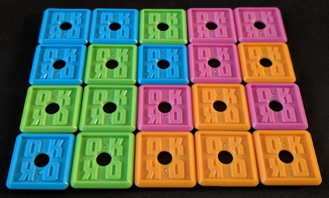
OK Play is a cleverly produced Connect-Four-style game that lives up to its claim that it can be learned in seconds. On your turn you place one of your tiles on the table; a tile must be flush against another tile (no corner-to-corner placement, just like in Carcassonne). If you run out of tiles, then take one of your already-placed tiles and move it elsewhere.
That’s it. Easy, right? The first player to connect five of their tiles in a row wins.
OK Play is a fast filler and I liked the familiarity of the connect-five goal along with the tile-laying mechanism. The game gets interesting once you’ve used all of your tiles and must move one of your already placed tiles.
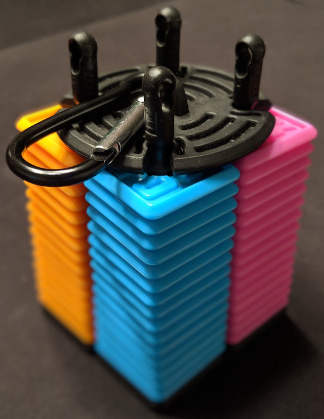
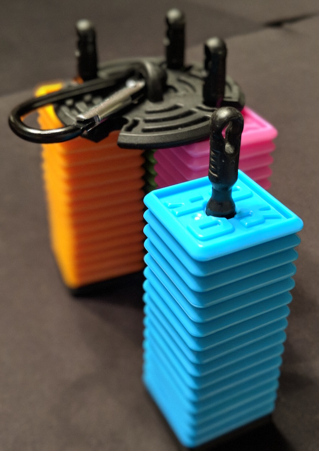
Best of all, it’s packaged in an easy-to-carry case that can be attached to your gaming bag and easily transported during your next trip.
One quibble: colorblind players may have trouble with the tiles. I suffer from red/green colorblindness and when I played my orange tiles, at certain angles they blended in with the green tiles.
A friendly reminder to game companies and designers, it’s such a simple fix: use a unique icon for each color, like Ticket to Ride. That’s all. This one little change will increase your game’s accessibility (and audience) by making it easier for colorblind players to play your game.
Disclosure: Thanks to Bananagrams (the distributor for Big Potato Games) for this copy of OK Play.


